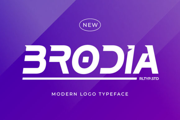
Brodia: A Modern Display Font for Digital Brand Identity
As a UI designer who ships dozens of landing pages, SaaS dashboards, and e-commerce experiences each year, I pay close attention to how typography shapes perception before a single word is read. Brodia stands out—not because it shouts, but because it carries quiet authority. It’s a display font built for the digital present with clear sightlines toward tomorrow’s interface standards.
Visually, Brodia balances geometric precision with subtle humanist warmth. Its letterforms feature clean terminals, even stroke contrast, and open apertures that support fast scanning—even at smaller sizes on mobile. Unlike many futuristic fonts that sacrifice legibility for novelty, Brodia maintains clarity in headlines, hero banners, and interactive elements without needing excessive tracking or line-height compensation. The design nods to advanced technology, yes—but never at the expense of usability.
Where Brodia Earns Its Place in Your Layout
Brodia thrives where visual hierarchy meets intention. Use it for hero section titles on product landing pages: its confident rhythm draws attention while reinforcing innovation and polish. On boutique online stores, apply it to category headers or limited-edition banners—it signals curation and distinction without overwhelming shoppers. For coaching or course websites, Brodia works powerfully in section headings (“Your Journey Starts Here”, “What You’ll Master”)—it conveys forward motion and thoughtful structure.
It’s not ideal for body copy. Brodia is a display font, not a workhorse sans serif—and that’s by design. Reserve it for short, high-impact text: CTA buttons (“Get Early Access”, “Join the Waitlist”), logo lockups, testimonial pull quotes, and branded social media graphics. In portfolio sites, it elevates project titles and case study intros, helping your work feel intentional and future-aware.
Readability Across Devices and Contexts
On responsive layouts, Brodia scales well from desktop hero text down to tablet-sized section headers. For mobile, avoid using it below 24px for primary headlines—its refined details need breathing room. When placed over image overlays, ensure sufficient contrast: pair it with semi-transparent dark or light masks (not pure white or black) and test against real device screens. On dark mode interfaces, Brodia holds up cleanly—its open counters prevent visual “clogging” at smaller weights.
For accessibility, always pair Brodia with a highly legible, WCAG-compliant sans serif for paragraph text—think Inter, Manrope, or IBM Plex Sans. These pairings create strong typographic contrast: Brodia sets tone; your body font delivers information. Avoid pairing it with other decorative or condensed fonts—its personality needs space to resonate.
Smart Pairing and Practical Implementation
A common mistake is overloading a layout with expressive type. Brodia shines when paired deliberately. Try it with a neutral, variable sans serif for body and captions—this gives you flexibility across weight and width without clashing tones. For editorial-style digital publications or brand storytelling sites, consider a restrained serif like Crimson Pro or Lora for long-form content, letting Brodia anchor key moments: chapter titles, quote callouts, or navigation labels.
Brodia includes multiple weights (Light through Bold), true italics, and OpenType features like stylistic alternates and ligatures—useful for logo variations or special campaign assets. Webfont formats (WOFF2 included) ensure fast loading, and multilingual support covers Latin-based languages used across global SaaS, education, and creative markets.
Licensing That Fits Real Digital Workflows
Brodia is a commercial font, and its license matters for how you ship it. If you’re embedding it in client websites, online stores, or digital templates sold on marketplaces, confirm the license permits web use with @font-face and unlimited pageviews. Many designers overlook this until deployment—don’t wait. For SaaS products or apps where the font appears in UI components (not just marketing pages), verify whether the license covers application embedding. Most reputable vendors offer tiered options: standard web, extended web + app, or full brand licensing for logos, merch, and video assets.
Why Brodia Builds Trust—Not Just Style
In digital experiences, typography silently communicates reliability. Brodia avoids trend-chasing gimmicks—no forced glitch effects, no exaggerated asymmetry. Its sophistication feels earned, not applied. That translates directly to user trust: visitors subconsciously associate clean, intentional type with credible brands, polished products, and respectful UX.
On conversion-focused pages—like pricing tables or checkout banners—Brodia’s balanced proportions and consistent spacing reduce cognitive load. Users scan faster and settle into decisions more confidently. It doesn’t distract; it directs. That’s especially valuable for founders launching new tools, designers building personal brands, or marketers running performance campaigns where every millisecond of attention counts.
Getting Started Thoughtfully
Before dropping Brodia into your next project, ask two questions: What action should this text prompt? and What feeling should it leave behind? If the answer is “sign up”, “explore”, or “trust us”—and the feeling is “capable”, “modern”, or “human-centered”—then Brodia is likely a strong fit. Test it with real copy, not lorem ipsum. Try it in your Figma library alongside your existing system fonts. See how it behaves beside your primary CTAs, form labels, and navigation items.
Remember: great typography isn’t about being noticed—it’s about making meaning easier to grasp, relationships easier to build, and intentions easier to act on. Brodia supports that mission with restraint, intelligence, and quiet confidence. It’s not just another display font. It’s a tool for shaping how people experience your digital presence—today, and as expectations evolve.